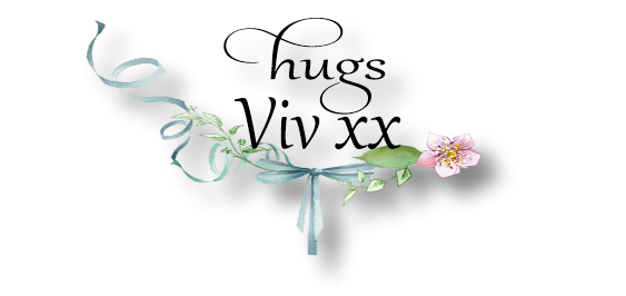
Alphabet card
Hi playmates, how is your weekend going so far?
I have managed to make a card despite the chaos
which is my craft room!
I make such a mess when I try to make just one
card arghh! This week over at 'Less is More'
it's a theme and ........
'Alphabet'
Hmm that set the old grey cells thinking, this is
what I came up with after a while. Come and
have a quick peek. I seem to be in a green and
blue mood today ;)
Enjoy your weekend whatever you are doing ;)
ps. Still no photo of my OH's latest model building alas,
he hasn't finished painting it yet. Not only that he has
half built two cottages and a church now too he he!!!
Think he is planning a whole village at this rate!
Goodness knows where they will all live lol, they are
on the shelves of our back sun lounge for now, glad we
have a really large shelf ! ;)
I randomly stamped and heat embossed letters on
the topper, thinking about it now I would use the
letters of the recipient's name ;) I used distress ink on
top and a few splashes of water.
I framed the topper after realising I had stuck the
topper on upside down with another layer of white card
for interest lol. I added an ombre
sentiment and sequins and job done!
White Linen card
TH Watercolour card
Concord & 9th Sophisticated Script stamps
Neat & Tangled die
TH Distress inks
Clear Embossing ink
Wow white E/P
Neat & Tangled sequins


16 comments:
Beautiful card, can't believe you made an error? Whatever, the end result is beautiful and what a great idea to use letters of the recipient, and a moment to realise you haven't! Another new header, - LOVE it.
Faith
x
That is such a great idea on using the different letters in the background. I love the pretty and airy colors you used here.
Love this design Viv it would be great with the letters of the recipients name. Your card looks like a summer's day!
Val x
Amazing how inventive we crafters can get! FAB card and so worth persevering!
Kathyk
Such a fun and creative idea. Love the layering of the topper LOL x Pretty colours and fabulous card x
Beautiful card Viv :-)
Hugs, Petra
This is lovely Viv... have just realized I don't own a SINGLE alphabet stamp set!!!
Great waterolouring again! And love the bit grungy look on this one!
Curious to see your DH's houses...
Have a fun and relaxing weekend!
Beautiful card....love those soft and pretty colors!
I love the blues and greens of this card! Great idea to emboss resist lettering in the background, and the additional layer of white card works really well so it was a lucky mistake getting the topper upside down originally! Thanks for playing along with us at Less is More :)
Beautiful card Viv love love the watercolour. Always perfect amount. So clever with the alphabet and the save on your card. Stunning
Love the watercolouring on this gorgeous card Viv.. and what a clever idea using the alphabet in that way!!
And I did smile.... as I thought it was only me that had the 'sticking things upside down' problem!
Christine x
Oh I do love reading your posts Viv, they always make me smile! Occupational hazard I think sticking things the wrong way up!!! BUT you've certainly pulled it off. A beautiful dreamy use of water colour and love how the letters are floating about to create your sentiment. Brilliant and as always thanks for playing with us at Less is More. Sarah x
You can use these lovely soft shades of blues and greens forever as far as I'm concerned, Vee! They are my faves, too! Your card is, as always, breathtaking!! Hugs, Dee
A beautiful card Viv, lovely colours and great take on the theme.
Pauline - Crafting with Cotnob
x
Ha! Had to giggle at your creative matting! How many times do we all do that type of thing, eh? Another stunner from you this week Viv in dreamy and watery blues and greens. Love how the script stamps really complement the font of the die. Superb! (Sorry I am so late commenting this week!) Thanks so much for sharing this with us at Less is More xx
Post a Comment